 Laura of Lauralines asked me yesterday, "I'm amazed there are still photos coming from your last trip to Paris!! Did you pre-plan your blog entries and are now unveiling them, bit by bit, till the end of your stash?"
I wish I was that organized. It's more of a stockpile of Paris images randomly recorded. I love going through them - like being there again when I need a Paris fix, and ideas pop into my head in the process. Just made-up theories...
 I mentioned there's a bit of a controversy over which is the more "Parisian" of the two cafés - Café de Flore or Les Deux Magots? In Adam Gopnik’s Paris to the Moon, he wrote at length, going into historical factors and issues of snobbism.
 He calls it , "the Two-Café Problem". It seems Parisians only want to be seen in the "right" café of the moment, even if it means waiting for a table when there are plenty of empty seats in the café across the street, says Q+a Magazine.
 Well, here is my hypothesis, and it's based solely on color theory and nothing else. Color acts on us in unconscious ways and drives us to do things we hadn't planned. The absolute winner of color combinations is rouge et verte or the RED/GREEN combo. It's the best pair of color compliments of all three.
RED - GREEN
ORANGE - BLUE
YELLOW -PURPLE
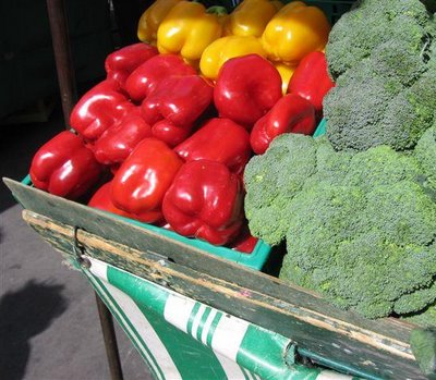
red + green turns up where ever you look. Go to your corner grocery or Farmer's Market. The grocer intuitively understands color theory and never painted a color swatch or had to sit in color theory class for hours.
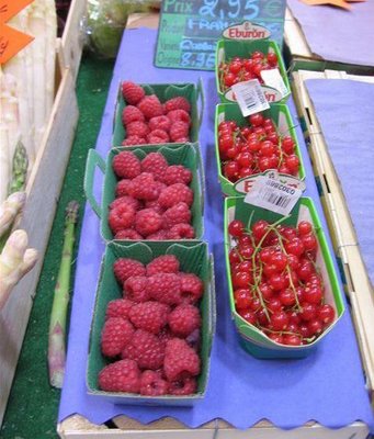 The RED tomatos are ALWAYS next to the GREEN peppers, lettuce, parsley etc. Christmas, who can avoid it, is a RED/GREEN holiday. RED roses have green stems and you see them every Valentines day, particulary in the hands of those who almost forgot ? Florists understand this intuitively. Red cherries have green stems, making them so much more appealing...someone up there gets color theory.
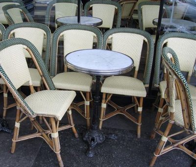
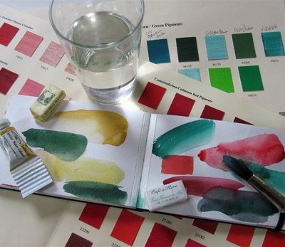 So what does any of this have to do with "the Two-Café Problem" you ask? Because the Café de Flore has the winning color combination - RED + GREEN. Les Deux Magots, malheureusement (unhappily), chose for their signature colors a creamy Naples yellow (my favorite color) + a deep forest GREEN. It's a classy combo, but it doesn't have the pulling power of the all-time winners, RED + GREEN.
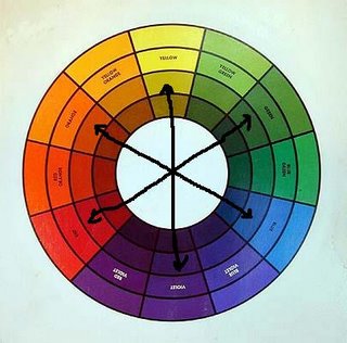 Maybe I should explain a bit more about complementary colors. They enhance each other and effect the brain too. Complimentary colors sit across from each other on the color wheel. So what?
Well, if you have a predominantly green color environment and than add a touch of red, the brain will make that green vibrate like crazy and the red will sing out like Callas. Get the picture?
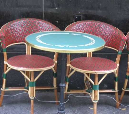
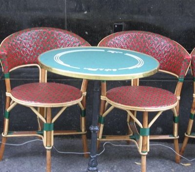
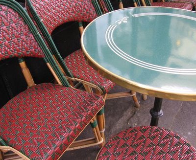 Café Flore's use of green as an accent color enhances those red chairs and makes it all the more appealing. Did you know that all important cafés in Paris have their own proprietary chaise (chair) designs and their own proprietary rattan weave as well? Maison J. Gatti is responsible for these. You can find them stateside at Cafe Society in San Francisco.
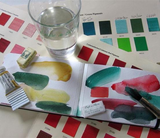
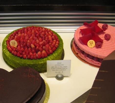
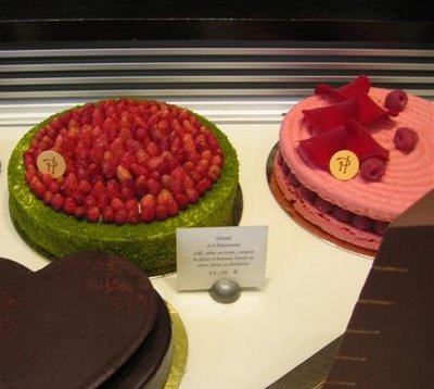 The master of the red/green combo is Pierre Hermé. I left a Kremer Pigments red color chart in his rue Bonaparte shop and realized belatedly that I'd forgotten to bring along the green color chart. Quelle disastre! Next visit in 52 days...
So, sorry Deux Magot, your signature colors are très classy and I'd take a set of your breakfast crockery anyday over Flore's. Your chocolate chaud is hands down the winner on the boulevarde, but you can't compete with the red/green combo. Adam Gopnik would have a good giggle if he read this... Nevermind color is powerful and even trés chic Parisians are not immune. So that's my theory on "the Two-Café Problem".


.jpg)