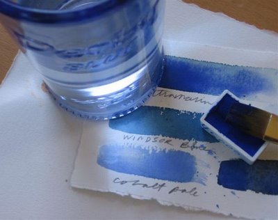
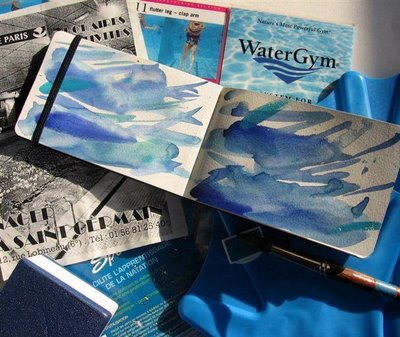
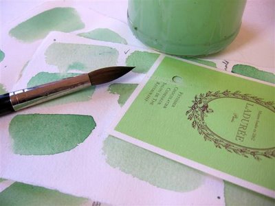
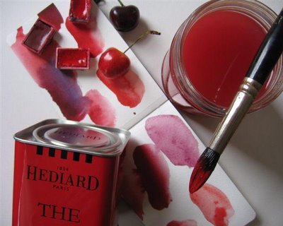
 I have a bag full of color test sheets I can't throw out.
 One of the 1st watercolor lessons you learn is to test out your colors on a paper scrap before putting brush to expen$ive watercolor paper.
I get attached to the test color scraps. Sometimes they're better than the so-called 'work of art'. After watercolor class I'd go round picking up the test scraps off the floor. The colors were lush, splashed on freely. Some of my own color test scraps are far superior to anything else IMO.
 People tear their hair out daily trying to get their walls to look like some swatch of paper with a divine color on it. They've fallen in love with that color and will settle for nothing else = it's madness. Has this happened to you?
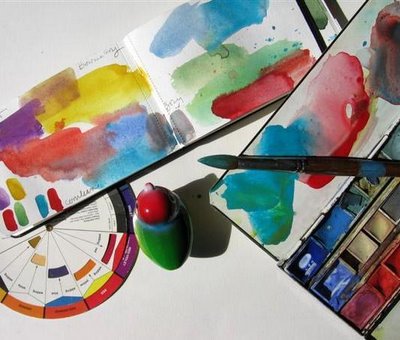 In many PB posts I'll mix up and match paint colors to whatever I'm writing on about, whether it be macarons, chocolate, swimming pools, cherries, toy birds, ice cream, orange, red, black, pink.
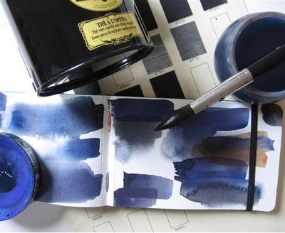 Long ago I took a color mixing class at Parsons. We could only use 3 primaries - RED + YELLOW + BLUE. We mixed colors until we were blue in the face for 6 weeks.

 People tear their hair out daily trying to get their walls to look like some swatch of paper with a divine color on it. They've fallen in love with that color and will settle for nothing else = it's madness. Has this happened to you?
  In many PB posts I'll mix up and match paint colors to whatever I'm writing on about, whether it be macarons, chocolate, swimming pools, cherries, toy birds, ice cream, orange, red, black, pink.
  Long ago I took a color mixing class at Parsons. We could only use 3 primaries - RED + YELLOW + BLUE. We mixed colors until we were blue in the face for 6 weeks.
Mixing GREENS is always difficult.
 That's the thing about color. It's so easy to fall in love with color. I thought I was mad for RED. All those ridiculous personality tests where they ask you your favorite color, I always put RED. But now I realize it's BLUE I can't stop using all over the place.
I took Dr. Lusher's color test for this post.
It told me:
Hungers for intensity in life and welcomes opportunity to take on challanges.
It told me:
Hungers for intensity in life and welcomes opportunity to take on challanges.
I love color mixing and matching.
It's one of those nice meditative, mindless activities you can do endlessly, yet at the same time is quite challenging. It's not as easy to match a color as you'd imagine.

They are beautiful, those swatches.
ReplyDeleteWhen I'm writing poetry, I usually scribble the first draft out on an old notebook. Then later I'll put it into the computer for editing (where it sits, done, doing nothing, but oh well...)
But I've kept those first scribbled drafts. I love them.
I agree that sketches/swatches can be treasures (if they're as lovely as yours, of course). I tend to keep a little photo of my paintings/doodles on my phone and so I have a mini personal gallery ~ silly! I laughed at your reference to "My Bologna" because while browsing 'older posts' long ago, I loved that particular post so much, I saved it on my PC's 'bookmarks' function for inspiration, so when I'm in there looking for something else, I frequently see this title whizzing by; naturally, today I opened it up and enjoyed it all over again. I've too have always declared red my favorite color; every room at home has some red, wardrobe peppered with red...but have a sort of cobalt blue focus wall at home so long I had to repaint it last week, as well as a dreamy blue bedroom, so I found myself asking this very same red vs. blue question. Not knowing the brand of paint I used 13 yrs. ago, oddly, I was easily and confidently able to match and choose the exact color from the myriad of chips and brands available at the paint store. Oh how I drone on .....
ReplyDeleteThe Color Test link has been fixed.
DeleteIt's HERE
The Wilcox book, Blue and yellow don't make green?
I like the little windsor and Newton color mixing paperback
I so enjoyed this and yesterday's sketching post. I have file folders filled with color swatches and little sketches on scrap. They are all lovely in a humble way, and provide insight into our thoughts about color and problem solving.
ReplyDeleteThe quiz was fun! Wow! What an accurate assessment of how I see myself.
Thanks!
Nanina
THANKS Nanina!
DeleteI'm glad I'm not the only one who hangs on to these little scraps of paper :)
Ahhhhh....sea foam green. Love it. It's such a '60s color -- like certain shades of aqua (Princess Phone) and maroon (Mustang convertible).
ReplyDeleteThat's what I love about watercolor...the paint itself is beautiful! Love, love, love your swatches! Tried to take the oclor test but it's not working just now...probably overwhelmed by all the PB readers trying to take it at once. Will visit later.
ReplyDeleteYears ago, when I signed up for my first 3 day watercolor workshop, I thought I'd get a head start and bought Michael Wilcox's workbook on color mixing...I mixed 20 pages with 50 colors per page before I took the workshop and started really painting. I still have all the sheets in a binder and often pull it out as a reference. Some day I should finish the rest of the sheets...only about 75 more to go!
I have spent hours and hours just mixing colors - it's a zen activity
DeleteCalms you down
I need to do it again
These personal posts are so inspiring:)
ReplyDeleteI bought many sets of artsy things for my 4 grandsons this AM..I want to encourage art in them..their moms do too..but this is a great idea..Carol..I am going to have them make colors one day..
I hope I find my color wheel somewhere:)
Color wheels are so fun!
Deleteand cheap too...must find mine to play with it again...
Those swatches are gorgeous Carol....keep splashing on freely!
ReplyDeleteBlue is my favorite color - nice to see so much of it!
ReplyDeleteI like your "test strips" - little works of art by themselves.
Enjoying your sketchbooks and images of colors
ReplyDeleteDon't know if you subscribe to French TV5 they have a documentary a 3 part series on color "Le Monde de Couleurs"
I think I have the books to this series- a couple research the use of color world-wide- Jean-Philippe and Dominique Lenclos,Colors of the World.
DeleteNo this is a different series.
DeleteMore here
I keep all of my color swatches too! I use some for collage. I love color, all colors, but turquoise has always been my favorite. Lately, I am leaning to ultramarine & alizarin crimson as well, more than usual. Your swatches and yesterday's sketchbooks cheered me up as I'm not feeling well! Thanks!
ReplyDeleteYes, lush colors, so free..David said "Take a bite out of the paper, saturate your brush...juicy color..."I've been mixing color charts a lot lately (maybe that's why I'm feeling so calm) & using mostly 3 colors...Posted one recently on which I then wrote stuff... Thanks for this luscious post, Rita
ReplyDeleteHow nice !!
ReplyDeleteI love your pictures ! Colors are so nice !
Lovely photos. I should do this. never have made a color chart. I am impatient. :) but these look great. I just need some better brushes and paper to do this on. Been a busy summer Critter and yard sitting for neighbors so no time for the painting I was planing on doing. This inspires me. :)
ReplyDeleteOmg, I followed your link to do the colour test and found the analysis scarily accurate!
ReplyDeleteCatching up on several lovely posts after being away - I so enjoyed the sketchbook peeks, but most especially yours!
Being from Dutch parents, Delft blue has an indescribable effect on me, even though I was born in Australia. It makes my heart race! :-)
ReplyDeleteSome of your colour tests are almost pieces of art by themselves! :-) Do you know the personality behind the different colour preferences?
ReplyDeleteDid you take the test Peter?
DeleteWhat's yr favorite color?
Completely breathtaking your colour swatches.
ReplyDeleteAt the Bauhaus exhibition in London I saw an amazing colour swatch wheel.
However, I prefer your loose ones. Really lovely x
PS Carol I left a reply to your question about "taking a good bite out of the paper" chez moi...Rita
ReplyDeleteTHIS is my favorite blog!!
ReplyDelete