 I have a bag full of color test swatches and I can't throw them out. The 1st watercolor lessons you learn, is test out your colors on a bit of paper before putting brush to expen$ive watercolor paper.
I get attached to test color scraps.
Sometimes they're better than the finished 'work of art'. After David Dewey's watercolor class I'd go round picking up test scraps off the floor. The colors are lush, splashed on freely. Some of my own color test scraps are far superior to anything else IMO. 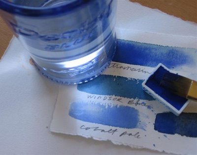
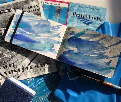 People tear their hair out daily trying to get their walls to look like some swatch of paper with a divine color on it. They fall in love with that color and will settle for nothing else = madness.
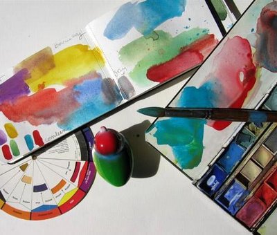 In many PB posts I'll mix up and match paint colors to whatever I'm going on about, whether it be macarons, chocolate, swimming pools, cherries, toy birds, ice cream, orange, red, black, pink etc.
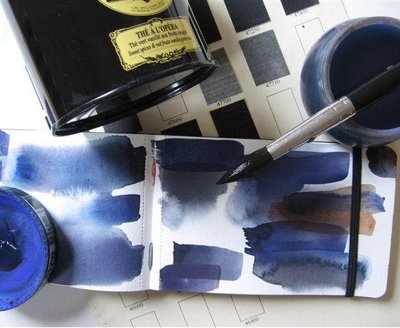 I once took a color mixing class at Parsons. We could only use 3 primaries, RED, YELLOW, BLUE. We mixed away till we were blue in the face for 6 weeks.
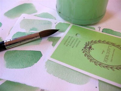
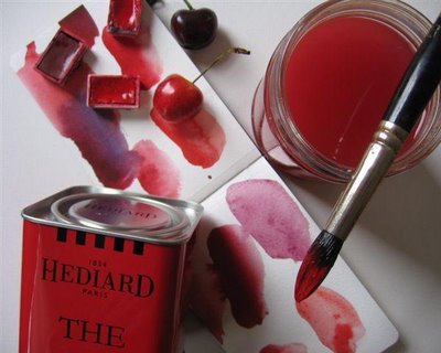 That's the thing about color. It's so easy to fall in love with. I thought I was mad for RED. All those ridiculous personality tests where they ask you your favorite color, I always put RED. But now I realize it's BLUE I can't get away from or stop using blue all over the place.
I took Dr. Lusher's color test for this post. You get to choose
A watercolor book I had, Spanish I think, had an exercise for making over 100 colors with just 3. Ilove color mixing and matching. It's a nice meditative exercises.
 People tear their hair out daily trying to get their walls to look like some swatch of paper with a divine color on it. They fall in love with that color and will settle for nothing else = madness.
 In many PB posts I'll mix up and match paint colors to whatever I'm going on about, whether it be macarons, chocolate, swimming pools, cherries, toy birds, ice cream, orange, red, black, pink etc.
 I once took a color mixing class at Parsons. We could only use 3 primaries, RED, YELLOW, BLUE. We mixed away till we were blue in the face for 6 weeks.
 That's the thing about color. It's so easy to fall in love with. I thought I was mad for RED. All those ridiculous personality tests where they ask you your favorite color, I always put RED. But now I realize it's BLUE I can't get away from or stop using blue all over the place.
Your most favorite/least favorite color etc. The results are not far off:
Hungers for intensity in life and welcomes opportunity to take on challenges and makes a focused effort to solve them. Wants to concentrate energy on achieving goals. Not to be sidetracked by outside influences. Aims to achieve impressive success by expending great effort and single-minded perseverance.
WOW! I'm loving this.
I took Dr. Lusher's color test for this post. You get to choose
 Tachisme, a French abstract art movement during the 40s and 50s, was a reaction to cubism and the equivalent to American abstract expressionism. Some of Les tashistes were Sam Francis, Hans Hartung, Georges Mathieu, Henri Michaux, Pierre Soulages. Being hooked on blobs, it's a natural that I'd love Sam Francis' paintings. You usually see him surrounded by sheets of paper on the floor -> giant color tests. And he looks incredibly happy. mindless activities you can do endlessly, yet at the same time quite challenging.
 It's not as easy to match a color as you'd imagine.

I really like your work - your drawings are charming. But I'm particularly fond of your color test sheets! I've been dabbling in watercolors for years without any kind of training but may go take a class just to make color test sheets.
ReplyDeleteLook forward to dipping into your lovely site often!
L
p.s. My local Le pain Quotidien is where I go to study my French...and nibble on a tartine now and again.
The blues, the greens, the reds are my favorite! I also have an attraction to that "corn on the cobb" yellow. Thanks for sharing.
ReplyDeleteThis was a great post Carol. There are some nice shades of colour there. This reminded me of the Dulux paint ad that's currently running on British tv,where shades of paint are portrayed as soap opera characters and paired up. They have exotic names like "Forest Lake". Don't know if you've seen it over there.
ReplyDeleteNAOMI
Everything has its value - even color test sheets. They look very pretty all lined up next to each other. It's kind of a work of art in and unto itself.
ReplyDeleteFYI: I posted some rules to a silly contest I have coming up on my blog. As a lover of all things Paris, I hope you can participate!
hey Carol, it seems like we're both thinking color and color mixing and testing. I just started a new Moleskine for color testing and mixing. I'm trying to have fun with what I do and trying not to take it too serious and hopping to come up with cool colors. I like this post very much!
ReplyDeleteluis
Such luscious samples ... they're beautiful to savor all on their own.
ReplyDeleteCarol! How i've missed logging on to your blog. I have an hour to spare and I can think of nothing better than to devour your posts. Miam miam!
ReplyDeleteYour color shenanigans are so much fun! It is a a joy just to scroll down from color grouping to color grouping. Btw, can you please talk KP into packaging more pans?? I love the box I bought, but would like to add more colors without having to mix them and bind them. Call me lazy.
ReplyDeleteCarol, I LOVE this post - first of all for all the luscious rich color photos you sprinkle here and there. Then for your always-elucidating thoughts on color , then for the way you just seem to grab a bunch of things the right color and put them together into these great illustrative images and finally for that list of other posts about color -- the way you wrote the post names IN color. Ahh, you have a fun blog. I really must get some work done today, though! heheh.
ReplyDeleteThese color photos would make a charming child's book about color. Have you ever thought of publishing these in something like a book for pre-K?