 Pale, pale green is unique I thought.
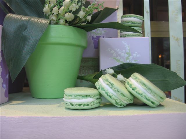
Then I looked in Amandine Guisez Gallienne's beautiful book, COLORFUL WORLD. Delicious pale green exists on the walls in Mexico, Finland, Mali, Rajasthan, on the Burmese border and elsewhere. I'd like to visit all these green, but I'm quite content to go back & have some more macs. Colors are always effected by what's adjacent to them.

A mixed color can look perfect when wet. Then it dries "down", much lighter and all wrong. Greens can be especially tricky to mix. It's not so easy to match a color exactly and takes a lot of experimenting.

Punch a hole in the color you want to match. Then hold it over the painted swatch. When you no longer can distinguish between the cut hole and the paint swatch you've got a match.

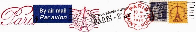
First time on rue Bonaparte I was just browsing. Next to Galeries Lafayette for a look but it seemed small and crowded. And 2 times I sat downstairs and had afternoon tea on Rue Royal.

I ordered a plate of 4 macarons -Citron, Caramel, Framboise, Chocolat. And a chocolate Religieuse mainly to photograph & then paint. I took only one bite - it's enormous!

The waiter offered to box the rest and I refused. Idiot! I didn't want to walk out with a doggie bag so I missed out having a green box for my own.

Mint green, moss green, Matcha and celadon green, terre vert, Granny Smith Apple green? Where did they come up with this shade of pale green?
From the underside of a rose leaf?
 |
| Today's post is a repost from 2006. I'm surrounded by cats and dogs in the studio. |


Thank you so much for your lovely blog....I just returned from Paris and You are what keeps me going until I return.....I can hardly believe that I can not just walk down 4 flights of stairs and go and get my croissants !!!
ReplyDeleteI never like my greens when I try to paint:) never..Poor you and your box regret..It looks rich and decadent..
ReplyDeleteDid you get your new camera I forgot my other daughter has a small canon..great pics too:)
Love the L paraphernalia and your art work ..of course..
I have a similar green pot from my friend Nancy..she painted her ex home all green..so pretty it turned out!
I just LOVE that green in its various forms here...so pleasant & uplifting...
ReplyDeleteLOVE this pale pale green
ReplyDeletePerfect for weddings!
Annie
Great technique to color test when you're mixing up colors especially for walls.
ReplyDeleteWhat a shame you missed out on the little green box! you won't do that again will you. Love the pale, pale shades of green.
ReplyDeleteThanks Lillian,
ReplyDeleteThis is a repost from 2006
I have way too many pale green boxes at this point! :)
When I was growing up in the 1960s I heard this color called Sea Foam Green.
ReplyDeleteNow I'm grown up and I've seen seven seas and I've never seen sea foam that color -- which only makes it more magical.
it's a gorgeous, very french green. sometimes also called "eau de nil"? love that name.
ReplyDeletebon retour a paris - sounds like you've unearthed some new good places for us! can't wait.
Exactement Paradis!
ReplyDelete'Eau de Nil' is it....
though I somewhat doubt the Nile is this pale, soft greeny color...
tell me I'm wrong.
I love when you share your colour mixing & other painting tips!
ReplyDeletethank you
The matching color by punching a hole in sample is brilliant!
ReplyDeleteI will teach my students that, with credit to PB of course,
thank you,
Maud Guilfoyle
It's an old, old trick Maude
DeleteYou used to be able to buy Value cards and they had little holes punched out to check the grays.
I like the opening shot the most, I think - something about the light on the green flower pot!
ReplyDeleteThat "too big" pastry looks fabulous.
I like your dog and cat sketches - they look so cute and lifelike!
Green is my favorite colour. I think about it a lot! I love to see your works-in-progress. I don't know how to paint so I find it all so fascinating!!!
ReplyDeleteConnie*
I love lavender and mint green together. Beautiful watercolor and beautiful photos!
ReplyDeleteThe daughter of friends, Ginger, met a Frenchman when they visited France a few years ago. She didn't speak any French, but fortunately, he could speak English. They ended up getting married, and lived in southern France for a couple of years. They just moved here in Michigan, because they could get better jobs. We were able to see them this past Sunday, and of course, I had to talk about macarons. Willy, his nickname, said he thought Laduree made the best macarons in France. He talked about all the beautiful colors. Man. It was so nice to talk to a real Frenchman!
what a story!
Deletechoosing Michigan over Provence????
to make a living vs. living in the French style
Oh my this has got to be my most FAVORITE post of yours, completely on the basis of color:D That green is amazing!!! I adore Tiffany's blue but that green is to DIE for, Carol! Its such a fine line mixing greens because it can go oh-so wrong ;) I agree about it looking apple green. I am surprised there is such a big difference in between the tag and the napkin. neverthe less, i love them both. Thank you for a fix of verte this morning. have a great day!
ReplyDeleteLove the apple green post! Wonderful little watercolor! Every time I visit you I want to pick up my paints. Very inspiring!
ReplyDeleteDo you remember the e.e. cummings poem that began
ReplyDelete"all in green went my love riding. . ."?