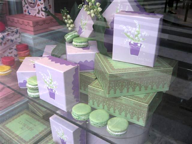
 Pale, pale green is unique I thought...
Then I looked in Amandine Guisez Gallienne's beautiful book, COLORFUL WORLD. Delicious pale green exists on the walls in Mexico, Finland, Mali, Rajasthan, on the Burmese border and elsewhere. I'd like to visit all these green, but I'm quite content to go back & have some more macs. Colors are always effected by what's adjacent to them.

Ladurée has put a band of pink around their tea cups to enhance the napkin's greeniness.

A mixed color can look perfect when wet. Then it dries "down", much lighter and all wrong. Greens can be especially tricky to mix. It's not so easy to match a color exactly and takes a lot of experimenting..
Punch a hole in the color you want to match. Then hold it over the painted swatch. When you no longer can distinguish between cut hole and the paint swatch you've got a match.

First time on rue Bonaparte just to browse. Next in Galeries Lafayette for a look but it seemed small and crowded. And 2 times I sat downstairs and had afternoon tea on Rue Royal. Upstairs is no-smoking but you miss all the action in the macaron shop nextdoor.

I ordered a plate of 4 macarons (Citron, Caramel, Framboise, Chocolat). And a chocolate Religiouse (mainly to photograph & then paint) I took only one bit - it's enormous!

The waiter offered to box the rest and I refused. Idiot! I didn't want to walk out with a doggie bag so I missed out having one of their green boxes for my own.

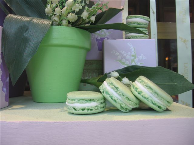
Mint green, moss green, celadon green, terre vert, Granny Smith Apple green - where did they come up with this shade of pale green? Off the underside of a rose leaf? A bientot!


What a very pleasing shade of green
ReplyDeleteThats a lovley green. I used to really worry painting green and know its my favourite colour to paint with. I just found your blog and think its great.
ReplyDeleteThank you La Page Francaise & Joanna :) Yes GREEN can be tricky..lots of practice mixing but nothing to fear. And Ladurée's green stands out in Paris.It's the only brand that uses green & immediately recognizable on the street.
ReplyDeleteCarol,
ReplyDeleteOh, so poetic...green from the underside of a rose leaf:) I have one of those Laduree boxes, carefully folded up for safekeeping. And of course I think pink and green is a great color combination:)
Carol I love your site and your watercolors, they're wonderful!
ReplyDeleteI felt I had to comment on this particular post because I've been in love with ladurée for years and that elusive "green" is one of my favorite colors. In a recent issue of the american House & Garden the creative director of Anthropologie's apartment is showcased and he had his kitchen painted in the Laduree green. Apparently they found it very difficult to get it just right!
Oh, have you ever tried the rose macarons? They're divine
Lucky you Anita to have a green box! I'm jealous :) Sometimes we do the silliest things in the name of propriety. Admittedly I sat down in the salon so I wouldn'd have to wait on the long line in the shop...
ReplyDeleteMoi - I never did taste the "rose" macarons...next time. I love the story of the Laduree-painted kitchen. The light is different in Paris. I don't even think Ladurée's walls are that color-it's used skillfully as an accent no one can forget.
I love the colours of Paris. That Laduree green is quite unusual. I am enjoying your blog!
ReplyDeleteBIG announcement! I've been informed that I must say,
ReplyDelete"Ladurée tout en vert"
"...because Ladurée vert is too direct and to be green is in french to be sick"
Uh oh..gotta do things the correct way!:)
I love all the images you've taken. The paintings are great as well. Love the idea of showing color in everyday life and how sometimes it could be so orderly.
ReplyDeleteluis
Thanks Luis for your comments. Color IS used in an orderly way in France. People think about it more IMO.Not just as a way to shout louder than other brands but as a way to say something poetic and expressive.The traditional attention to detail plays a role too.
ReplyDeleteGorgeous post.
ReplyDeleteI'll be thinking about green all night.
I love the color themes of your posts. I also noticed that that green is iconic of La Duree. Pale green is to La Duree as turquoise is to Tiffanys. Great post.
ReplyDeleteThank you Newyorkdely for your comments & reminding me of Tiffany's pale blue. I'd come to think that only Paris truly understands the secrets of branding with color...still they are far ahead - with all their ribbons and stickers & paraphrenalia. I covered a Moleskine notebook with those chocolate stickers...I was so greedy for them :)
ReplyDeleteI thing it's better Ladurée tout en vert, because Ladurée vert is too direct and to be green is in frensh to be sick, you see tout en vert is an iidication for the color not for the heath...
ReplyDeleteHow effortlessly the watercolors blend in and among the food photos. Layering as in the final image of violet boxes on shelving that distorts our location as consumers of eye candy.
ReplyDeleteHow could you resist to leave this wonderful macaron there?????!!!!!! :)
ReplyDeleteTHIS is a GREAT link Cory!
ReplyDeleteMERCI Anything macaron is wonderful...
thank heaven, with time, you have come to your senses! A good box or bag (though they must be really special to rate as being good) is a treasure to keep and keep. I have boxes older than my son!
ReplyDeleteInteresting technique to color match.